
Responsive Website Development Company in Faridabad
Websites that adjust smoothly to every screen, so customers get a comfortable experience on phones, tablets and desktops.
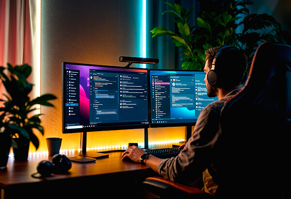
Responsive Website Development in Faridabad
Most visitors now reach business websites from a smartphone. A responsive website development company in Faridabad builds pages that automatically adapt their layout, text size and images to the device being used, so nobody has to pinch, zoom or scroll sideways.
Primitive Softech develops responsive websites using flexible grids, scalable images and tested breakpoints. The result is a single website that works consistently across screen sizes, which is simpler to manage than maintaining separate mobile and desktop versions.
What is included:
- Flexible grid-based layouts
- Mobile-first coding approach
- Cross-browser and device testing
- Image and speed optimisation
Our Responsive Development Process
Responsive work needs testing at every stage. We build and review on real screen sizes instead of assuming the layout will adapt correctly.
Define Screen Priorities
We identify which devices your visitors use most and decide how content should be arranged on each.
Build Mobile First
We start with the small-screen layout and then expand the design for tablets and larger monitors.
Optimise Media
Images, fonts and scripts are compressed and sized so that pages stay quick on mobile data.
Test Across Devices
We check layouts on common browsers, operating systems and screen sizes before launch.
Types of Responsive Website Projects We Handle
Responsive development applies to nearly every kind of website. These are the projects we see most often.
Responsive Business Websites
Company websites that keep menus, text and contact options clear on any device.
Responsive Online Stores
Product listings, carts and checkouts that remain simple to use on small touchscreens.
Responsive Redesigns
Conversion of older fixed-width websites into flexible layouts without losing existing content.
Landing Pages for Campaigns
Fast mobile-ready pages designed for visitors arriving from ads or social media.
Benefits You Will See
One website that works on all devices
Better experience for mobile visitors
Easier updates from a single codebase
Stronger foundation for search visibility
Why Responsive Design Matters for Faridabad Businesses
People in Faridabad search for services while commuting, shopping or working. A customer might look up a restaurant near Sector 21, a repair service in Ballabgarh or a supplier in an industrial area, and the search is often done on a phone. If the website is difficult to read on a small screen, the visitor will leave quickly. A responsive website removes this obstacle by adjusting automatically to the screen in front of the user.
Search engines also consider mobile usability. Google primarily uses the mobile version of a page for indexing and ranking, so a site that works poorly on phones can find it harder to perform in search results. Responsive development does not guarantee rankings, but it provides the technical base that other SEO efforts depend on, including readable text, tappable buttons and stable layouts.
Performance is part of responsiveness. A layout that fits the screen but takes a long time to load still disappoints visitors. We resize images for different devices, load only the scripts that are required and keep the code light. Fonts are limited to what the design needs. These steps help pages load quicker on average mobile connections, which is important in areas where network speed varies.
Responsive development works best alongside good design and content. Our website designers prepare layouts that make sense on small screens, and our developers turn them into working pages. If you already have a fixed-width site, we can assess whether a redesign or a rebuild is the better route. Businesses planning a full website can also look at our website development services and business website development pages.
We test layouts on a range of widths, from compact phones to large desktop monitors, and across commonly used browsers. Forms, menus, sliders and pop-ups are checked because these elements often break first on small screens. After launch, we can help monitor how visitors behave on different devices so that further improvements are based on actual usage.
To begin, send us your current website address or a description of the site you want. We will review it on a few common screen sizes, point out usability and speed concerns and recommend whether a redesign, a partial update or a new build makes sense. This initial review helps you understand your options before committing to a budget, and it gives our team a clear picture of the work involved in making your website comfortable on every device.
Why Choose Primitive Softech for Responsive Website Development?
Our approach is practical: build for the devices your audience uses, test them properly and keep the site light and maintainable.
Mobile-first development: We begin with phone layouts so that essential content is never an afterthought.
Thorough device testing: Layouts are reviewed on multiple screen sizes and browsers before release.
Speed-conscious coding: Lean code and optimised media help pages load promptly.
Accessible and readable: Font sizes, contrast and touch targets are chosen for comfortable reading and use.
Continued support: We assist with updates and fixes when new devices or browser versions require changes.
Responsive Website Development — Frequently Asked Questions
Other Services We Offer
Website Design
We create stunning, user-friendly, and mobile-responsive websites that captivate your audience and reflect your brand identity.
Learn More
Website Development
Robust, scalable websites built with clean, modern code — from corporate sites to custom web applications.
Learn More
E-Commerce Development
Complete online store solutions with secure payments, inventory management, and conversion-focused design.
Learn More
CRM Software Development
Custom CRM solutions that streamline your sales pipeline, customer interactions, and business operations.
Learn More
SEO Services
Data-driven SEO that improves rankings, drives organic traffic, and turns searches into customers.
Learn More
Social Media Marketing
Engaging social media campaigns that build brand awareness, community, and drive measurable results.
Learn MoreReady to Grow Your Business Online?
Your website should do more than exist. Let’s turn it into a clear, trusted growth channel that brings your business more attention, enquiries, and momentum.
From first idea to measurable progress, we keep your digital journey moving forward.